
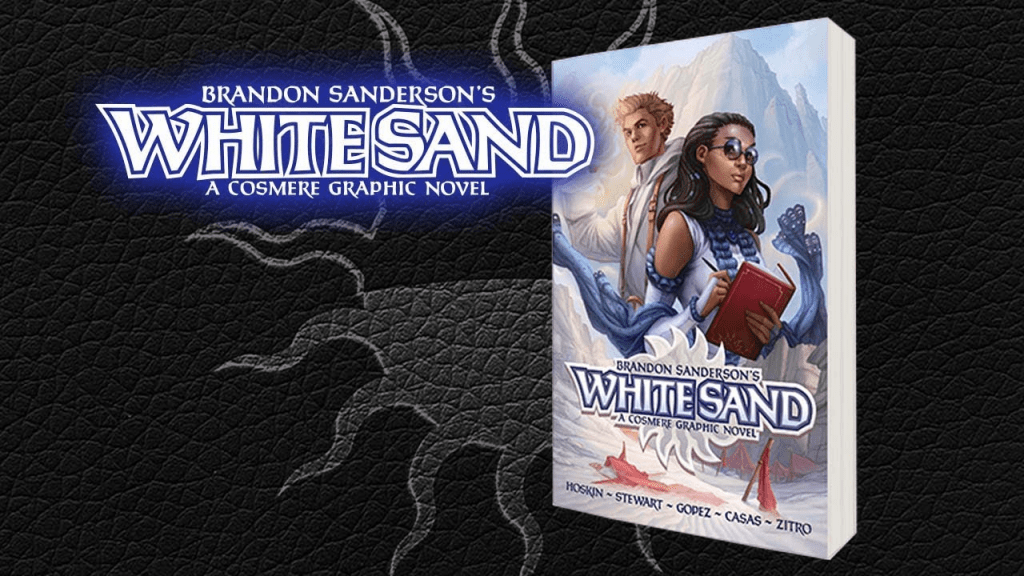
White Sand was the last piece of Brandon Sanderson’s Cosmere I tracked down when I first got up to date and I almost immediately reached the conclusion that it is the universe’s worst story, and that it wasn’t close. It was a slog to get through, and until my reread I could not have told you a thing about its ending or named a single character. The tweaks and updates to the omnibus version take it from ‘worst Cosmere entry by a lot’ to just ‘worst Cosmere entry by a bit,’ which is about as much as I think anyone dared hope for it.
Going back through part one actually had me thinking I’d been too hard on poor White Sand the first time. Whether it was the new prologue, the updated dialogue or my own desire to find something to like in it on the second go around, I was feeling a much stronger sense of the characters and their motivations, and the first artist’s style lends itself best to the desert backdrops and carapace-covered creatures. The spread showing the destruction after the first big battle sequence is actually breathtaking. There’s stuff to like here. The Ars Arcanum being included as a series of between-chapter cut-ins similar to all the sketches and notebook pages in Stormlight is a wonderful addition as well.
But then Kenton’s muted reaction to his people being genocided and the deaths of almost everyone he knows makes it hard to connect to him and feels out of character for the highly emotional being he was in the opening chapters. It’s like the destruction of the Diem had to happen from a plot perspective but overcoming grief and mourning wasn’t factored into the poor guy’s character arc so it just doesn’t happen.
It’s bits like that where you can really feel this being a story Brando made before he was good enough to get published.
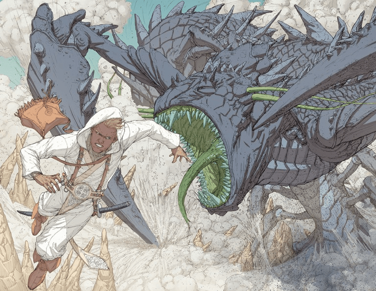
It’s in part two where I was reminded fast and hard why I disliked White Sand so much the first time around. The story is more or less fine now that it’s rolling, even if the misunderstandings that kept Khriss from finding out what Kenton could do stretched my suspension of disbelief, but it’s here the art really just turns to garbage. Kenton burning himself out early on meant we didn’t get to see all that much sand mastery in part one. Now that he’s got it back, the artist reveals that he has no idea how to depict it and is not willing to try anything. The sand ribbons have so much visual potential, especially in close quarters combat, but not a single assassin attack scene does anything with them. Kenton just kinda glows and does stuff. It’s hard to follow and looks awful. Issues that had been slowly building from part one become more prominent. Characters’ faces have an infirm quality to them and sometimes make expressions that seem at odds with what they’re saying, and having to focus on them in all the politicking scenes reveals it. Continuity is rough, with characters dramatically changing their staging relative to each other between panels. And this is after the omnibus removed all the modern tech from the backgrounds.
I can deal with some sketchy art. God knows I’m a vocal defender of Oda’s super-busy panels and cluttered pages in One Piece, but this is beyond even me.
I haven’t read anything else this Julius Gopez has worked on. He seems to do mostly superhero stuff and that’s just not my jam, but everything that comes up on a google image search for his name looks better than this.
And what the hell is with this panelling? All these jagged shapes that break up the flow of the page and disrupt the natural path of the eye. I’m not a traditionalist for many things, but simple grid-based panelling is the standard for a reason. Maybe you get a bit of slanting for the action scenes as a treat, like the comic version of a Dutch angle, but even then the whole row better follow the same tilt.

If you’re breaking from the grid, you better have a good reason you’re trying it. Locke and Key gets away with Gopez-style broken glass panelling for a single issue because it had a very specific and obvious mood it was trying to achieve that was intended to disrupt and disorient the reader. White Sand does it just to do it.
Part three, with a new artist taking the lead, starts to reign the story back in. I think the art can be a little too simple and short on detail in the backgrounds, with a lot of big open spaces, but at least the characters are distinct and the action intelligible. The final duel between Kenton and Drile finally delivers on the promise of sand mastery as a visual magic system and makes you wish we’d been doing things like this all along. Kenton’s arc reaches a reasonably satisfying conclusion during the battle.

But the story of White Sand doesn’t conclude so much as it just kinda ends. Kenton is left at a decent place, but almost nothing is wrapped up for the supporting cast. Khriss’s political struggles are ongoing and her sand master solution far from certain. Ais is departing on a new journey to sort out her conflicts with her faith. Aarik had compromised on his convictions and retreated into himself. Everyone except Kenton seems to end the book starting up a new arc. It feels like a tragic level of sequel certainty for a story that really hasn’t earned a follow-up.
And I’d consider that another sign of White Sand being adapted from a pre-publication novel. I’ve got first drafts in my trunk that end in a very similar way.
White Sand is frustrating. I want to like it more than I do – the potential visual spectacle of sand mastery and the ideas behind a planet with permanent day and night sides is fascinating (even without seeing the night side at all), but the art issues that plague the first two thirds of the book and that newbie-author clunkiness showing through from the unpublished novel it was adapted from undermine its attempts to be something great at every turn. Even with the massive improvements the omnibus edition brings it can’t help being the weakest link in the Cosmere chain.

Leave a comment